
 As Maya 2011 users may know, in this release of a popular 3D software packet user interface was almost completely rewritten and now is based on widely known in some circles Qt framework. Along with this default color scheme is changed to dark grey, which is likely pretty well accepted by users, but still some of them may like to have good old white color scheme. Fortunately developers provided us possibility to tweak this and have old-style color scheme for those who want it.
So, in addition to default dark gray UI style there is some other ones:
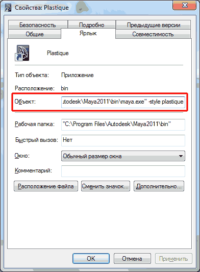
To enable selected style just create a Desktop Shortcut to maya.exe and add to "Object" field additional string -style [style name] . For example, for Plastique style Object text field will look like this: "C:\Program Files\Autodesk\Maya2011\bin\maya.exe" -style plastique
And some pictures of how UI will look with those styles, from left to right they are ( move mouse cursor over image to see full-sized version ): Plastique, Cleanlooks, Motif, Windows, CDE.
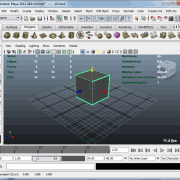
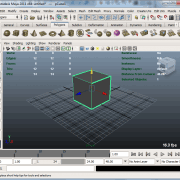
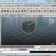
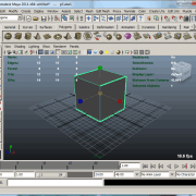
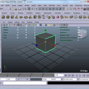
Personally I like Plastique style as alternative to default dark gray UI — it's sexy and smooth looking. It's maybe a good idea to have two shortcuts on your desktop and select UI style by your mood. :)
thank you for this information it help me for change dark interface to light interface in Maya thank you
Hated the new dark ui. Plastique looks great, alot like the old UI. Thanks for this!
Yeah, plastique style looks really good. I actually had a problem with my vision on dark UI — at the first time it was too contrast for me, so text in menus get blurried, with the effect of "double vision" ( it is astigmatismus, I believe ). But lately I have worked with it some more time and get used to it, now it's OK. Still good for Autodesk to let people choose their style.
Тогда и другие стили интерфейса вам могут быть интересны:
-monolith
-windows
-cleanlooks
-motif
-cde
-plastique
Worked for me in case of Maya 2012 too!! liked Plastique attribute.